Page updated: 07 April 2026
Photoshop Blending Modes: A Comprehensive Guide
Every Photoshop Blending Mode: A Complete Guide with Examples & Quick Reference Table
Photoshop’s blending modes can be confusing because Adobe’s definitions are technical and don’t explain how they behave in real editing. This guide breaks down every blending mode with clear examples, real‑world use cases, and a quick‑reference table so you can understand what each mode does and when to use it.

ON THIS PAGE
Why This Guide Is Different
Most blending mode tutorials list the modes without explaining how they behave in real editing. This guide focuses on practical, real‑world examples that photographers and retouchers actually use. Each mode is shown with four different test images so you can clearly see how it affects colour, contrast, and detail.
Most Used Blending Modes (Quick Reference)
These are the blending modes used most often in real‑world Photoshop editing. They cover the majority of practical tasks including darkening, lightening, contrast control, and colour work. The full list of all 31 blend modes appears later in this guide.
| Blend Mode | Best Use | Effect / Behaviour |
|---|---|---|
| Multiply | Darkening skies, deepening shadows. | Multiplies pixel values; ignores white; produces rich, natural darkening. |
| Screen | Brightening, softening shadows, glow effects. | Lightens by inverting Multiply; ignores black; ideal for gentle brightening. |
| Overlay | General contrast enhancement. | Combines Multiply and Screen; increases contrast; ignores 50% grey. |
| Soft Light | Subtle contrast, natural texture enhancement. | Softer version of Overlay; smooth, gentle contrast changes. |
| Hard Light | Strong contrast and punchy effects. | Uses Multiply on dark pixels and Screen on light pixels; more intense than Overlay. |
| Color | Colour grading, tinting, selective colour work. | Applies hue and saturation from the blend layer while keeping luminosity from the base. |
Blending Modes Introduction
Blending Modes are also commonly referred to as Blend Modes.
They are basically how one layer interacts, or blends with, the layer (or layers) beneath, based on mathematical equations or algorithms. Layers are blended depending on their hue, saturation, luminosity, or a combination of these. The results of blending the same two layers with different blend modes can vary widely.
Blend Modes are non-destructive. They do not change the layers below and you can always change the Blend Mode of a layer.
There 27 main Blend modes that you will find in several places in Photoshop, and a total of 31 Blending Modes. Each has a different effect. These effects also depend on what you are blending with what, so it’s impossible to know or remember all options. It’s also not possible to precisely predict all effects. A large part of using blend modes is to experiment, but it helps if you have an overall understanding of the blend mode groups and of the main blend modes.
Blend Modes are arranged in groups and each group has similarities. Understanding some key blend modes will help you find a starting point to find a blend mode for your purpose.
Opacity vs Fill. Note that most blend modes work the same whether you adjust opacity or fill, but some blend modes work differently when adjusted with either, for example a Solid Color Adjustment Layer with the Hard Mix blend mode.
Where to Find Blending Modes
Blend Modes are available in several different places in Photoshop, including;
- Layers Panel Blend Modes are most commonly used in the Layers panel to change the blend mode of the layer and thus change how it interacts with other layers
- Tools Blend Modes are available for some tools, including Brush Tools and Clone Stamp
- Stroke (Edit > Stroke)
- Smart Filters Blend modes are not available within the filter settings, but after applying a Smart Filter, you can change the blend mode of that filter
- Layer Styles Many of the Layer Styles (Layer Effects, or fx) use blend modes, including Bevel & Emboss, Stroke, Inner Shadow, Inner Glow, Colour Overlay, Gradient Overlay, Outer Glow, Drop Shadow

Three Main Blend Mode Groups You Should Know
There are many blend modes and each also depends on what you are blending with, so it’s impossible to know or remember all options. A large part of using blend modes is to experiment, but it helps if you have an overall understanding of the blend mode groups and of the main blend modes.
Blend Modes are arranged in groups and each group has similarities. Understanding some key blend modes will help you find a starting point to find a blend mode for your purpose. The first group includes Normal and Dissolve. Normal is the default blend mode. The next three groups perform the following;
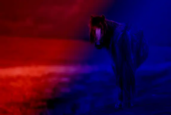
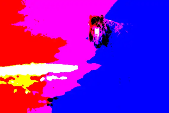
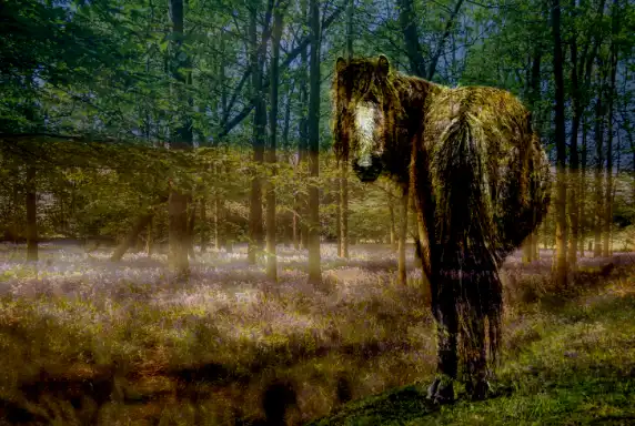
Darken: The blend modes in this group all darken in different ways. Multiply: Ignores white, makes things darker and deepens some color. This works like sandwiching two 35mm slides together. Multiply is the opposite of Screen.
Important Points to Note
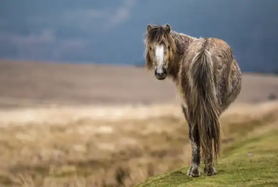
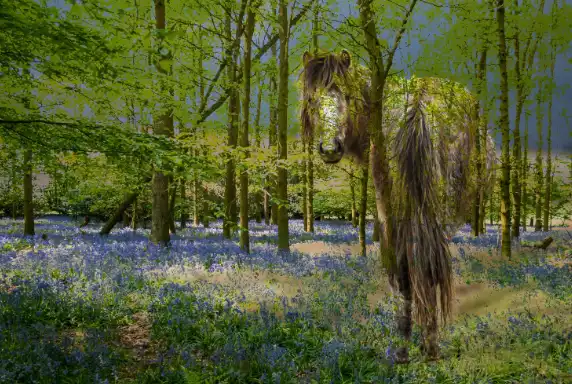
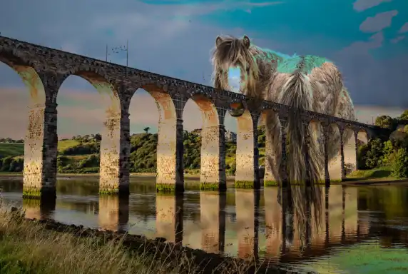
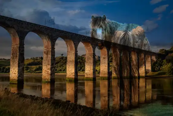
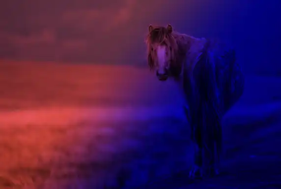
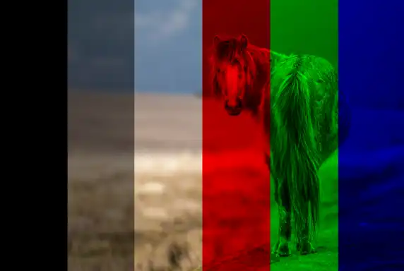
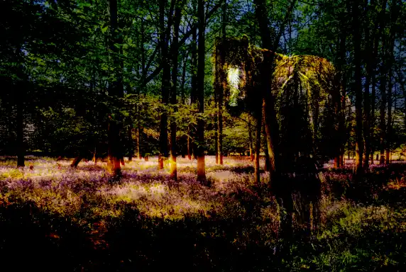
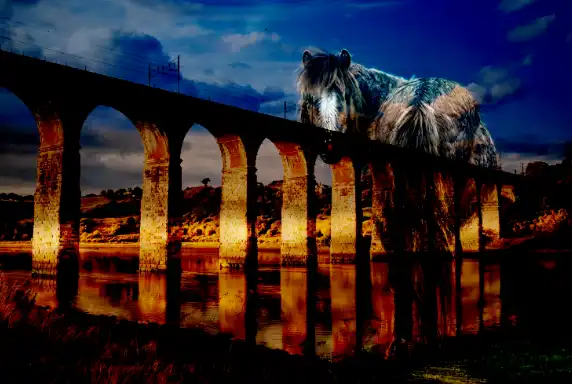
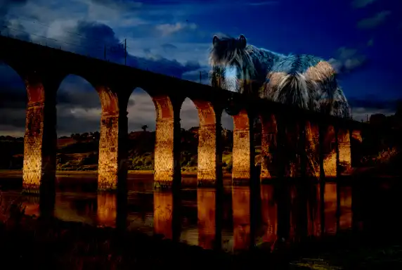
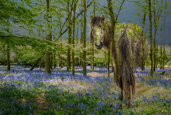
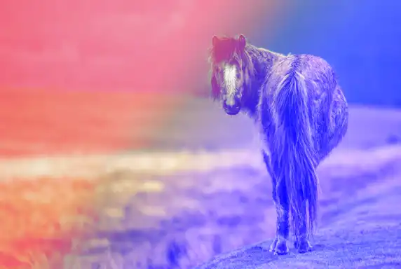
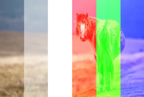
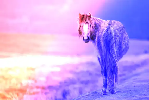
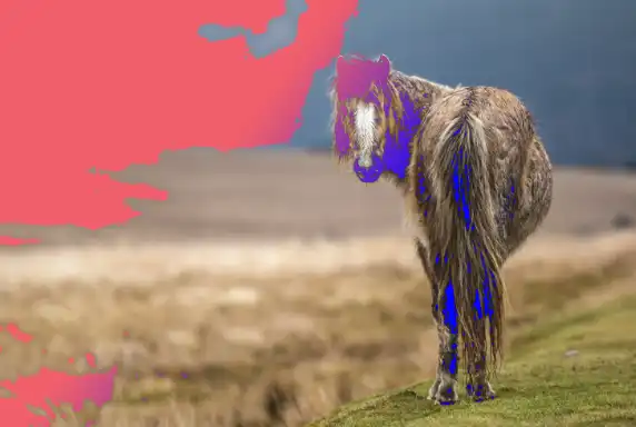
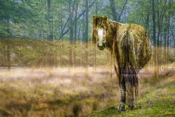
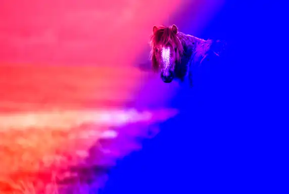
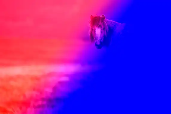
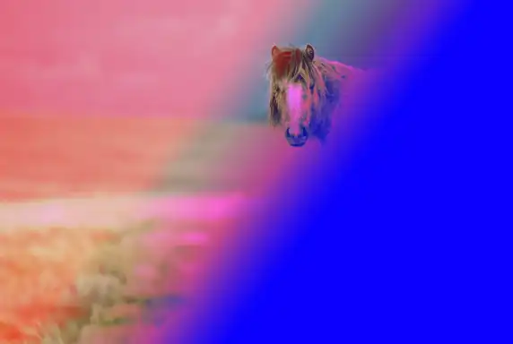
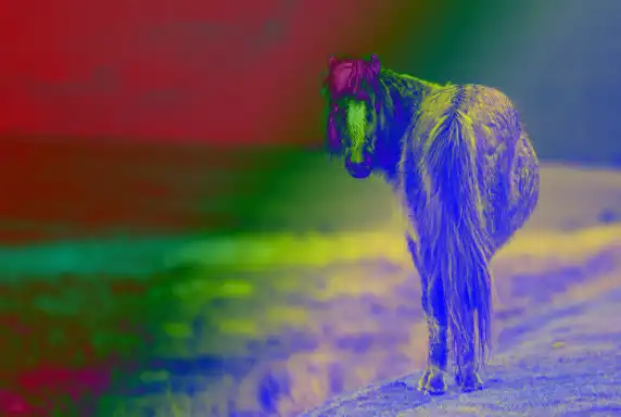
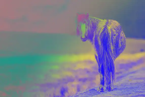
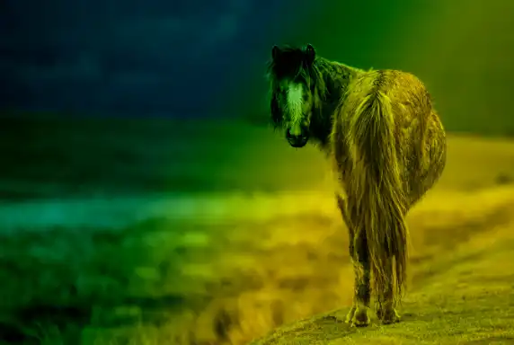
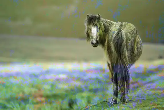
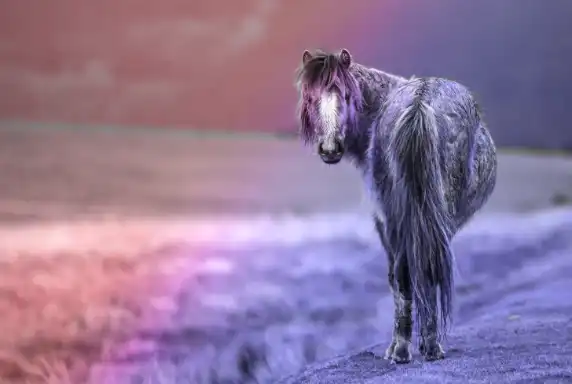
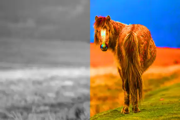
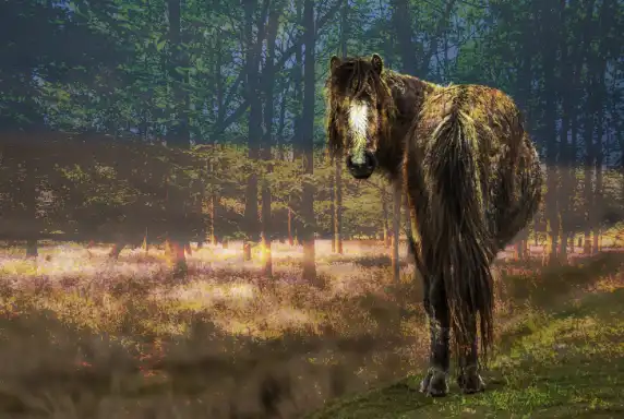
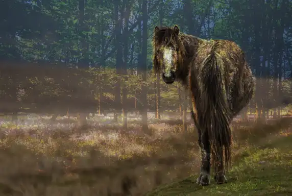
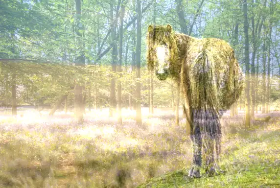
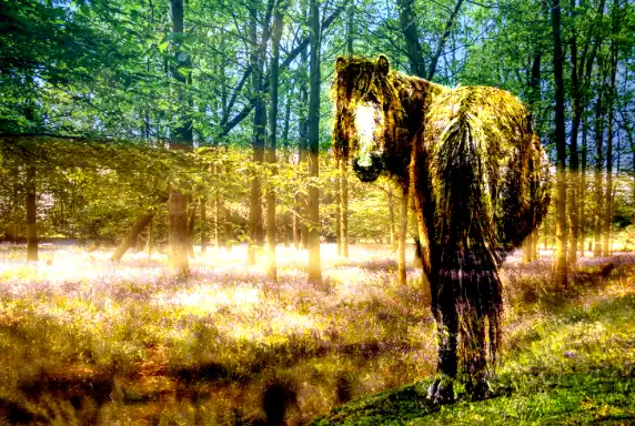
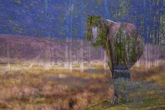
Original photo, background image
This horse image is the base layer (background) used for every blend mode example that follows.
Each blend mode works by interacting with the pixels beneath it, so keeping the same base layer ensures every example is directly comparable.
All blend‑mode layers are shown at 100% Opacity and 100% Fill to demonstrate the pure behaviour of each mode.
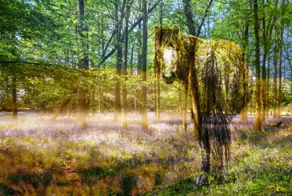
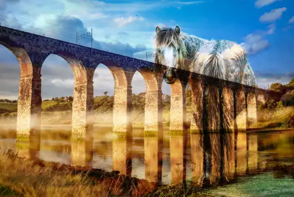
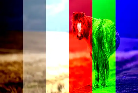
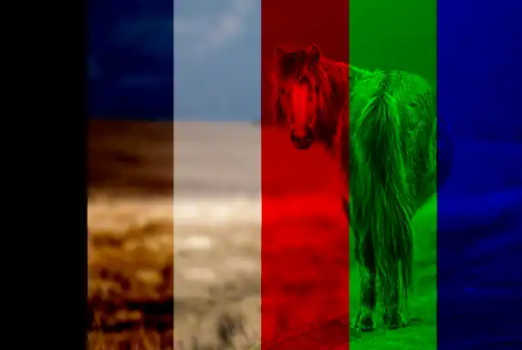
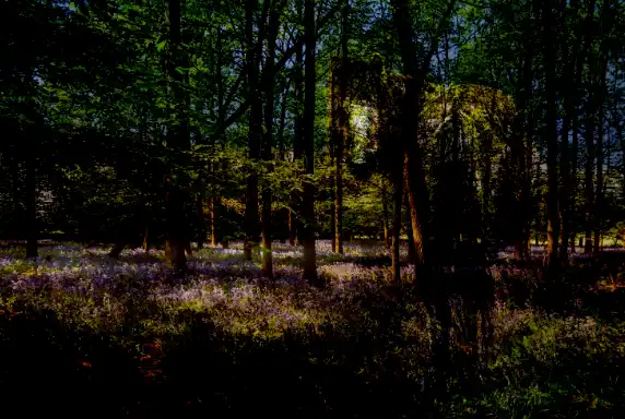
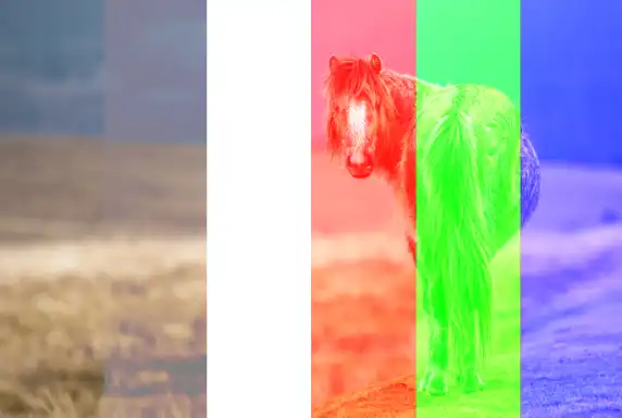
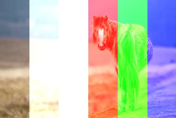
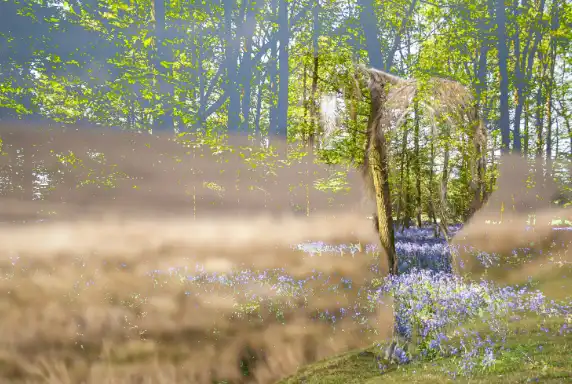
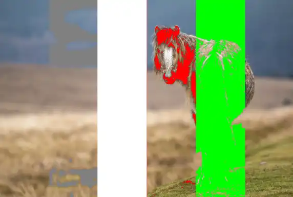
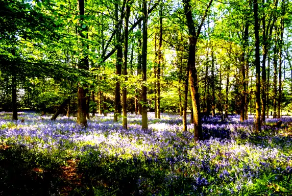
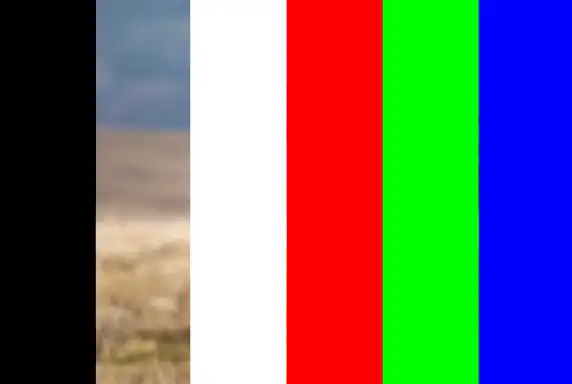
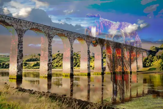
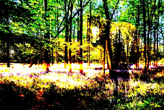
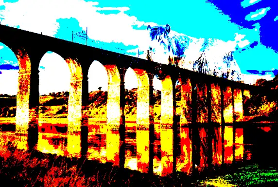
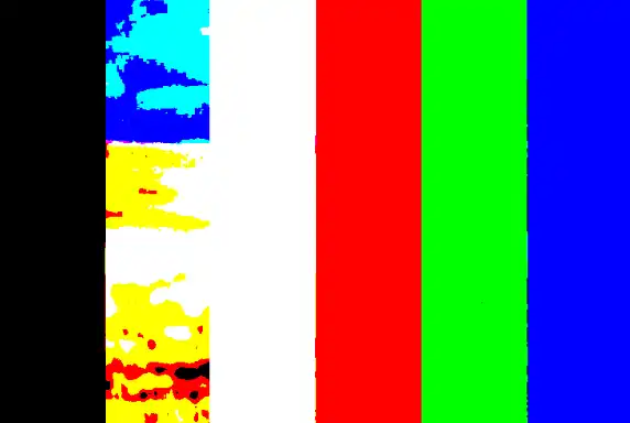
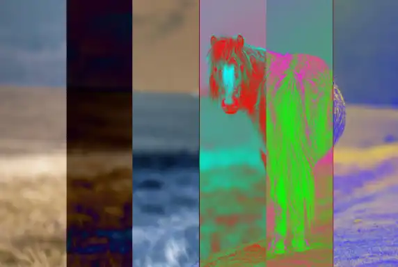
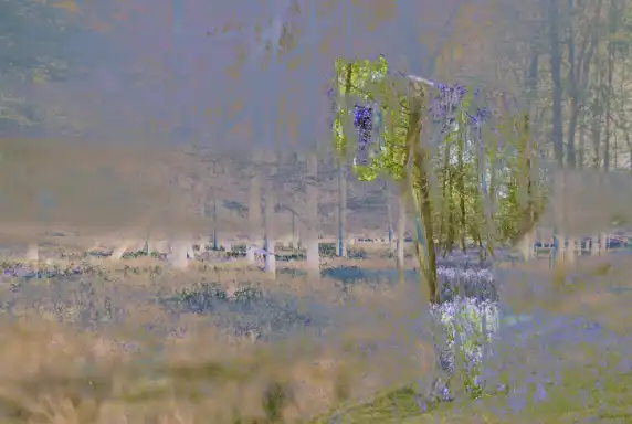
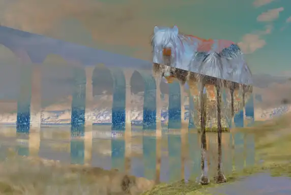
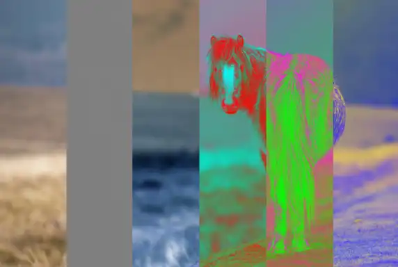
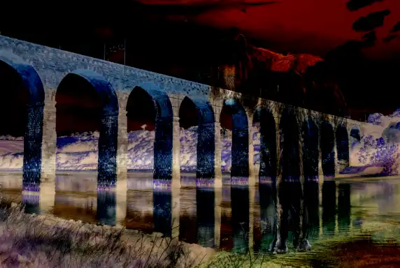
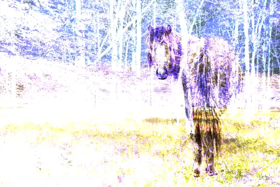
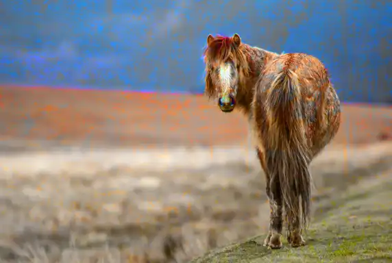
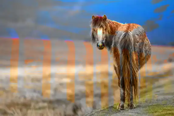
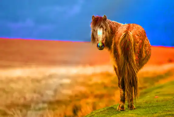
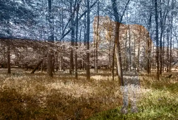
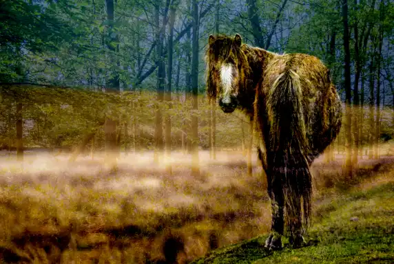
The four test images above each blend mode show different types of detail: soft foliage, hard architectural lines, a smooth colour gradient, and a test card with black, white, mid‑grey and primary colours. Together, they reveal how each blend mode handles texture, tone, colour, and contrast.
Every Blend Mode Detailed
This section covers every Photoshop blending mode in detail, with four example images for each mode so you can clearly see how it affects colour, contrast, and tonal relationships. Each mode behaves differently depending on what it’s blended with, so these examples give you a consistent, side‑by‑side way to understand the real‑world effect of each one.
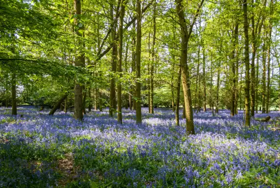
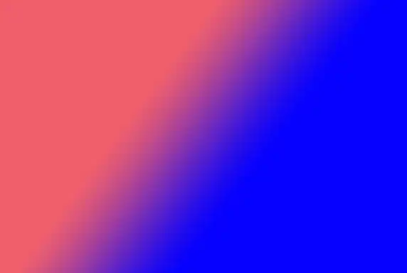
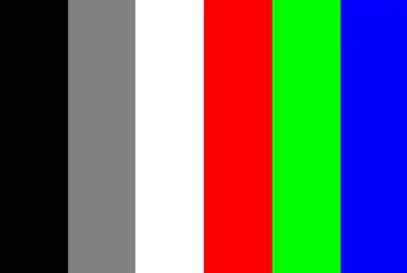
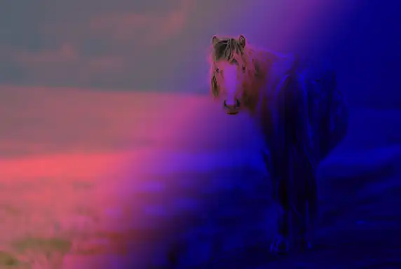
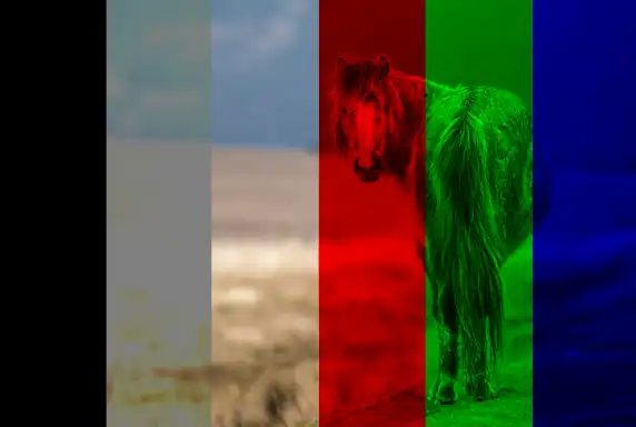
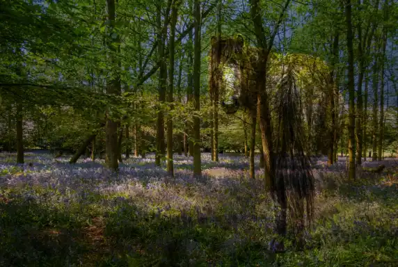
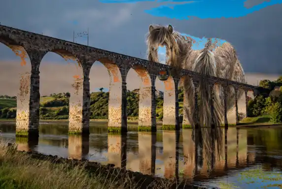
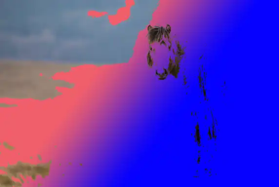
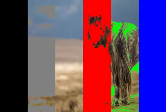
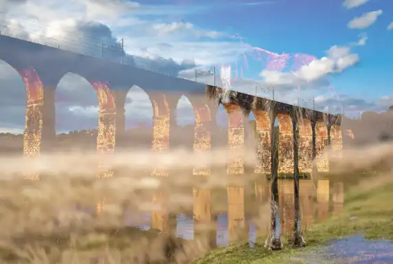
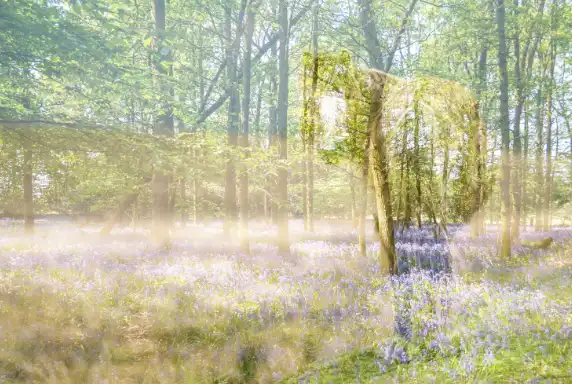
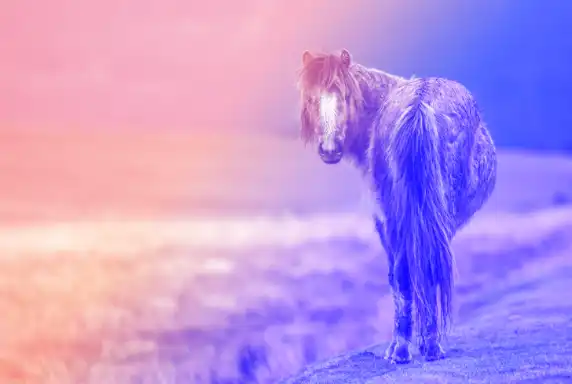
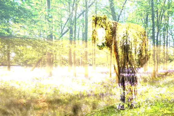
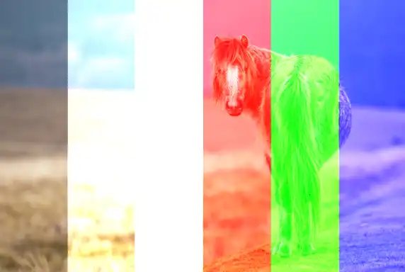
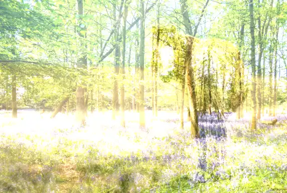
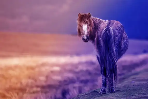
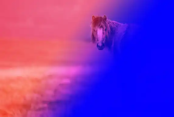
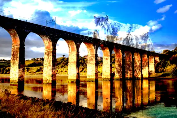
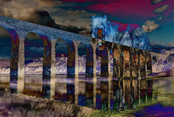
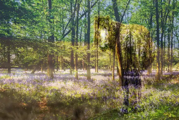
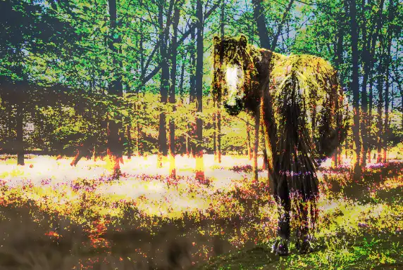
Each blending mode below is shown using the same four test images, displayed first in their original state (Normal mode), so you have a clear baseline for comparison. The trees and bluebells image reveals how blend modes affect soft detail, colour shifts, and subtle tonal transitions. The viaduct image shows how they handle hard edges, structure, and contrast. The gradient (pink to blue), demonstrates how tones and hues interact across a smooth transition, making it easy to see where a mode lightens, darkens, or shifts colour. The test card shows the mathematical behaviour of each mode with pure black, white, mid‑grey, and primary colours. Using these four images together gives you a consistent, reliable way to interpret the real‑world effect of every blend mode.
The examples below start with Normal mode as the baseline, (which show original images), followed by every other blend mode in the order they appear in Photoshop.
Normal Group
Normal
This is the default blending mode. It simply displays the top layer without any blending. The only way to change the appearance is by changing opacity or fill, although they have the same effect.
- Use when you do not want any blending or interaction between layers.
- Use for standard retouching, cloning, and painting where the result should be literal.
- Use as a baseline before testing other blend modes.


Dissolve
Randomly replaces pixels with the base or blend color, depending on opacity. Creates a grainy effect. To see this effect, reduce opacity or fill.
- Use when you want a speckled, noisy edge as opacity is reduced.
- Use for stylised, grainy transitions rather than smooth fades.
- Use sparingly for special effects, not for normal photo work.


Darken Group
Blend Modes: Darken, Multiply, Color Burn, Linear Burn, Darker Color
These blend modes will darken the underlying layer.
Darken
Compares pixels and keeps the darker ones, replacing lighter ones. Darkens the image overall. Opposite of Lighten.
- Use when you want to keep only the darker pixels from the blend and base layers.
- Use for simple replacement of lighter areas without strong contrast changes.
- Use when you want a gentle darkening effect compared to Multiply.
Multiply
Multiplies the base and blend colors, resulting in a darker image. Often used for shadows and darkening effects. This is one of the more commonly used blend modes.
- Use to darken an image overall in a natural way.
- Use to deepen skies, shadows, and midtones without clipping highlights too quickly.
- Use to remove white backgrounds from textures, logos, or overlays.
Color Burn
Similar to Multiply, it increases contrast, darkens the base color to reflect the blend color and intensifies the colors.
- Use when you want very strong darkening with increased saturation and contrast.
- Use for dramatic, high‑impact colour effects rather than subtle corrections.
- Use carefully on low opacity to avoid harsh, posterised results.

Linear Burn
Darkens by reducing brightness. Similar to Color Burn but with less contrast, darkening the base color with the blend color.
- Use to darken while reducing overall brightness, often more linear than Color Burn.
- Use when Multiply is not strong enough but Color Burn is too aggressive.
- Use for moody, low‑key looks with controlled contrast.
Darker Color
Compares the base and blend colors, keeping the darker of the two.
- Use when you want a hard choice between the darker colour of the two layers, not a blend.
- Use for compositing where you want to keep darker shapes or blocks of tone.
- Use when Darken gives too much soft blending and you need a more decisive result.
Lighten Group
Blend Modes: Lighten, Screen, Color Dodge, Linear Dodge, Lighter Color
These blend modes will lighten the underlying layer.
Lighten
Compares pixels and keeps the lighter one. Brightens the image overall. Opposite of Darken.
- Use when you want to keep only the lighter pixels from the blend and base layers.
- Use for simple replacement of darker areas without strong contrast changes.
- Use when you want a gentle lightening effect compared to Screen.

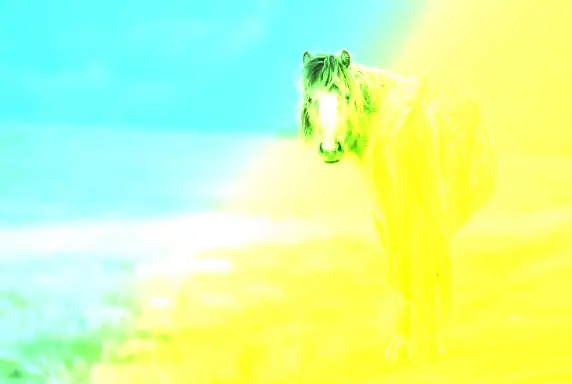
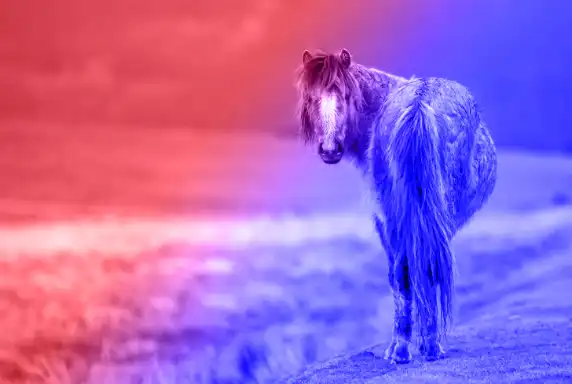
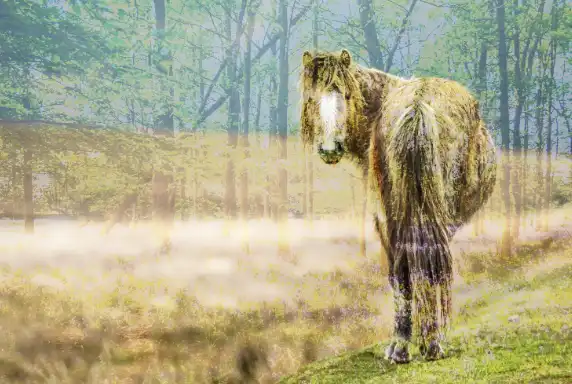
Screen
Opposite of Multiply. Brightens the image by multiplying the inverse of the colors. Black and white are not changed. It's used for lightening and brightening.
- Use to brighten an image overall in a natural way.
- Use to lighten shadows, haze, or underexposed areas without blowing highlights too quickly.
- Use to remove black backgrounds from light effects, flares, or textures.

Color Dodge
Brightens the base color by reducing contrast. Creates a glowing effect. Black is not changed.
- Use when you want very strong brightening with increased saturation and contrast.
- Use for intense light effects, glows, and highlights rather than subtle corrections.
- Use at low opacity to avoid harsh, clipped highlights.

Linear Dodge
Similar to Color Dodge but with less contrast, lightening the base color with the blend color. Black is not changed.
- Use to brighten while increasing overall brightness in a more linear way than Color Dodge.
- Use for strong light effects, fire, neon, and glow overlays.
- Use when Screen is not strong enough but you still want smooth transitions.


Lighter Color
Compares the base and blend colors and keeps the lighter color, replacing darker ones. Opposite of Darker Color.
- Use when you want a hard choice between the lighter colour of the two layers, not a blend.
- Use for compositing where you want to keep lighter shapes or blocks of tone.
- Use when Lighten gives too much soft blending and you need a more decisive result.

Contrast Group
Blend Modes: Overlay, Soft Light, Hard Light, Vivid Light, Linear Light, Pin Light, Hard Mix
These blend modes affect contrast.
Overlay
A combination of Multiply and Screen. Dark areas become darker, and light areas become lighter, increasing contrast.
- Use to increase contrast by darkening dark areas and lightening light areas.
- Use for adding texture, grain, or detail without completely overpowering the base image.
- Use for dodging and burning on a 50% grey layer for non‑destructive contrast shaping.
Soft Light
Similar to Overlay, but less intense. Applies a subtle effect, darkening or lightening the base color depending on the blend color.
- Use for gentle contrast and lighting changes, softer than Overlay.
- Use to add subtle vignettes, soft dodging and burning, or gentle texture overlays.
- Use when Overlay feels too strong or harsh.


Hard Light
Combines Multiply and Screen like Overlay, but with more intensity, creating a sharper contrast. It's a commonly used blend mode, but you will often benefit by reducing opacity.
- Use when you want a stronger, more dramatic version of Overlay.
- Use for bold contrast effects, graphic looks, or stylised lighting.
- Use at low opacity to avoid overly harsh transitions.


Vivid Light
Combines Color Dodge and Color Burn, creating a highly contrasty effect with intense highlights and shadows. Adjusting opacity or fill produces different effects.
- Use for extreme contrast and saturation changes driven by the blend layer.
- Use for special effects, edgy colour grading, or experimental looks.
- Use at low opacity or with carefully prepared blend layers to avoid banding.


Linear Light
Combines Linear Dodge and Linear Burn, producing a strong contrast and more noticeable adjustments to brightness. Adjusting opacity or fill produces different effects.
- Use for strong linear contrast and brightness changes based on the blend layer.
- Use for advanced dodging and burning with precise control over tonal shifts.
- Use when you need powerful tonal shaping and are comfortable masking and controlling opacity.

Pin Light
Replaces colors depending on the blend color's luminance. Lighter areas stay the same, and darker areas may get replaced with pure black or white.
- Use for unusual, patchy effects where midtones are replaced and extremes are kept.
- Use for experimental, graphic, or abstract looks rather than realistic photo work.
- Use when you want to create broken, posterised textures or stylised patterns.


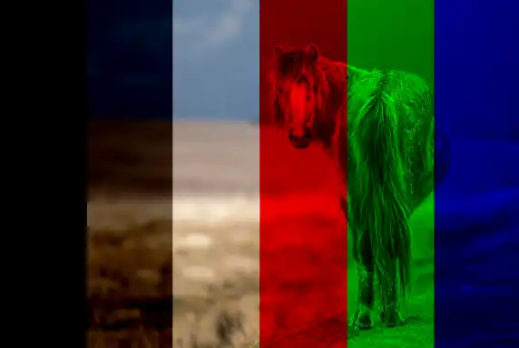
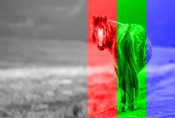
Hard Mix
Creates a posterized effect, blending with harsh color contrasts (only 8 possible colors result). Reduces colors to primary tones (red, green, blue, etc.).
- Use when you want a highly posterised, limited‑colour result based on channel thresholds.
- Use for graphic, pop‑art, or screen‑print style effects.
- Use at low opacity or with adjustment layers to tame the harshness.
Comparative Group
Blend Modes: Difference, Exclusion, Subtract, Divide
These compare and invert colors between layers. They create differences in color and can be used for aligning layers (e.g., for photo stacking or panoramas), comparing two layers to see the difference, or for creating surreal, inverted color effects. .
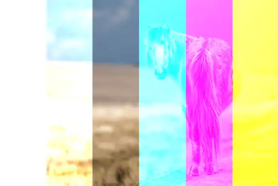
Difference
Subtracts the blend color from the base color or vice versa, creating inverted colors.
- Use to compare two layers and highlight differences between them.
- Use for aligning layers or checking registration by looking for areas that turn neutral.
- Use for creative, inverted, or psychedelic colour effects.

Exclusion
Similar to Difference, but with softer results, creating an effect of lowered contrast and more muted colors.
- Use for a softer, lower‑contrast version of Difference.
- Use for creative colour shifts and surreal looks with less harsh contrast.
- Use when Difference is too strong but you like the inverted‑style effect.
Subtract
Subtracts the blend color from the base color, creating darker results.
- Use to subtract the blend layer’s brightness from the base, darkening the image.
- Use for technical or experimental work where you need to remove specific tonal information.
- Use carefully, as it can quickly produce very dark, clipped results.


Divide
Divides the base color by the blend color, often creating bright, washed-out effects.
- Use to divide the base layer’s brightness by the blend layer, brightening the image.
- Use for technical corrections, such as removing uneven lighting or shading patterns.
- Use when you need to normalise illumination across a surface.

Component, or Composite Group
Blend Modes: Hue, Saturation, Color, Luminosity
Changes color quality, using a combination of white and primary colors (red, green, blue).
Hue
Applies the hue of the blend color while keeping the luminance and saturation of the base color.
- Use when you want to change only the hue (colour family) while keeping the base layer’s luminosity and saturation.
- Use for targeted colour changes, such as changing clothing colour while preserving shading.
- Use when you want natural‑looking colour swaps without affecting lightness.

Saturation
Applies the saturation of the blend color while keeping the hue and luminance of the base color.
- Use when you want to apply the saturation of the blend layer to the base layer.
- Use to increase or decrease saturation using a simple gradient or painted map.
- Use carefully, as areas with zero saturation in the blend layer will desaturate the base completely.
Color
Applies the hue and saturation of the blend color while keeping the luminance of the base color. Great for recoloring, for example, hand coloring old black and white photos.
- Use when you want to change both hue and saturation while keeping the base layer’s luminosity.
- Use for colour grading, toning, and tinting while preserving the original lightness and contrast.
- Use for realistic recolouring of objects, skin, and scenes.


Luminosity
Applies the luminance of the blend color while keeping the hue and saturation of the base color. Useful for adjusting brightness without affecting color.
- Use when you want to apply the brightness and contrast of the blend layer while keeping the base layer’s colour.
- Use for luminosity masking, contrast adjustments, and sharpening workflows.
- Use when you want to separate tone control (luminosity) from colour control.

Blend Modes where Opacity and Fill have different effects
With most blend modes, adjusting opacity or fill has the same effect. However there are some blend modes that have a different effect by adjusting opacity or fill. Sometimes the differences are subtle, but sometimes adjusting Fill can have a significant impact.
Color Burn
100% opacity & fill
50% opacity, 100% fill
100% opacity, 50% fill
Linear Burn
100% opacity & fill
50% opacity, 100% fill
100% opacity, 50% fill
Color Dodge
100% opacity & fill
50% opacity, 100% fill
100% opacity, 50% fill
Linear Dodge
100% opacity & fill

50% opacity, 100% fill
100% opacity, 50% fill
Linear Light
100% opacity & fill
50% opacity, 100% fill
100% opacity, 50% fill
Hard Mix
100% opacity & fill
50% opacity, 100% fill
100% opacity, 50% fill
Difference
100% opacity & fill
50% opacity, 100% fill

100% opacity, 50% fill
Quick Reference Table - All Blend Modes
The explanations and examples above show how each blend mode behaves in real‑world editing. To make the whole system easier to navigate, the table below gives you a quick‑reference summary of every blend mode, what it’s best used for, and the effect it produces. If you already know the basics and just want a fast way to compare modes, this table is the most efficient way to do it.
You can also click any blend mode in the table to jump directly to its explanation above. Then "go back" to return here.
| Blend Mode | Best Use | Effect / Behaviour |
|---|---|---|
| Normal | Standard editing and painting. | No blending; the top layer fully covers the layers beneath. |
| Dissolve | Special effects and stylised noise. | Creates a speckled, grainy transition as opacity is reduced. |
| Darken | Replacing lighter areas without strong contrast changes. | Keeps the darker pixel from either layer; no true blending. |
| Multiply | Darkening skies, shadows, textures; removing white backgrounds. | Darkens naturally by multiplying pixel values; preserves highlight detail. |
| Color Burn | Dramatic darkening and saturated colour effects. | Boosts contrast and saturation; can become harsh at high opacity. |
| Linear Burn | Moody, low‑key looks; stronger than Multiply but smoother than Color Burn. | Darkens by decreasing brightness; produces deep shadows. |
| Darker Color | Compositing where darker shapes must be preserved. | Chooses the darker colour channel‑by‑channel; no blending. |
| Lighten | Replacing darker areas without strong contrast changes. | Keeps the lighter pixel from either layer; no true blending. |
| Screen | Brightening images; removing black backgrounds; adding light effects. | Lightens naturally by inverting Multiply; preserves shadow detail. |
| Color Dodge | Intense highlights, glows, and bright effects. | Strong brightening with increased saturation; can clip highlights. |
| Linear Dodge | Fire, neon, glow overlays; strong light effects. | Brightens by increasing brightness linearly; stronger than Screen. |
| Lighter Color | Compositing where lighter shapes must be preserved. | Chooses the lighter colour channel‑by‑channel; no blending. |
| Overlay | Contrast boosts; texture overlays; dodging and burning. | Combines Multiply and Screen depending on brightness; increases contrast. |
| Soft Light | Subtle contrast; gentle lighting; soft dodging and burning. | Softer version of Overlay; smooth, natural contrast changes. |
| Hard Light | Bold contrast; graphic looks; stylised lighting. | Uses Multiply or Screen depending on blend layer brightness; strong effect. |
| Vivid Light | Edgy colour grading; special effects. | Uses Color Burn or Color Dodge depending on blend brightness; extreme contrast. |
| Linear Light | Advanced dodging and burning; strong tonal shaping. | Adjusts brightness linearly; powerful and precise but intense. |
| Pin Light | Experimental, abstract, or posterised looks. | Replaces midtones; keeps only highlights and shadows; patchy effect. |
| Hard Mix | Pop‑art, graphic, or screen‑print effects. | Reduces colours to 6–8 tones using channel thresholds; very harsh. |
| Difference | Alignment checks; surreal or inverted effects. | Subtracts pixel values and takes the absolute value; high contrast. |
| Exclusion | Softer inverted looks; creative colour shifts. | Similar to Difference but lower contrast and smoother transitions. |
| Subtract | Technical work; removing specific brightness patterns. | Subtracts blend brightness from base; quickly becomes very dark. |
| Divide | Correcting uneven lighting; flattening illumination. | Divides base brightness by blend brightness; brightens strongly. |
| Hue | Changing colour families while keeping shading. | Applies blend hue but keeps base saturation and luminosity. |
| Saturation | Controlling saturation using gradients or painted maps. | Applies blend saturation; zero saturation removes all colour. |
| Color | Colour grading; tinting; realistic recolouring. | Applies blend hue and saturation; keeps base luminosity. |
| Luminosity | Luminosity masking; contrast control; sharpening workflows. | Applies blend brightness and contrast; keeps base colour. |
Happy editing!