Page updated: 05 April 2026
The Basic Panel in Lightroom Classic
A simple, first‑pass Develop workflow using only the Basic panel
Before and After Comparison
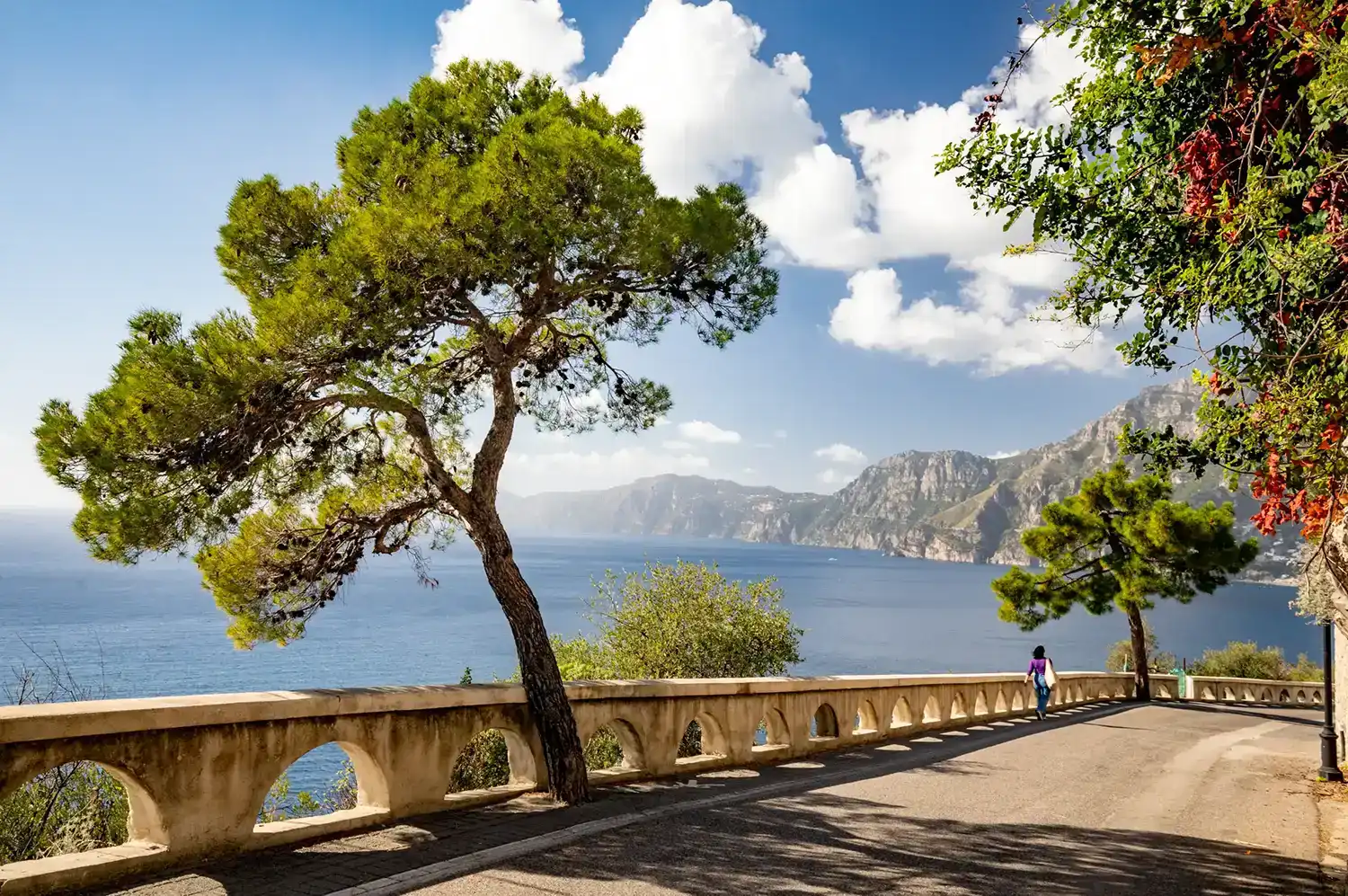
These two images show the original raw file and the photo after being adjusted as shown below, using just the Basics panel. No masks or any tools outside the basic panel were used.
ON THIS PAGE
Why start with the Basic panel
The Basic panel is where most everyday editing happens. It controls the overall brightness, contrast, color, and texture of the image. Before you touch the Tone Curve, HSL, or Masking, a clean Basic panel edit gives you a solid, natural foundation. This tutorial walks you through a simple, repeatable workflow you can use on almost any image. The goal is not to create dramatic effects — it is to make your photo look intentional, consistent and natural.
- White Balance sets the color of the light.
- Exposure and Contrast define the overall brightness and shape.
- Highlights, Shadows, Whites, Blacks control detail and depth.
- Presence and Color refine texture and mood.
What this tutorial covers
This guide teaches a reliable order for using the Basic panel: starting with Auto for a fast baseline, then white balance, exposure, contrast, and color You will also learn how to avoid common mistakes like over‑contrast, crunchy texture, or overly saturated colors. Later tutorials will cover the Tone Curve, HSL, Masking, and Calibration. For now, everything happens inside the Basic panel.
See the Lightroom Histogram tutorial to understand and use the Histogram more effectively.
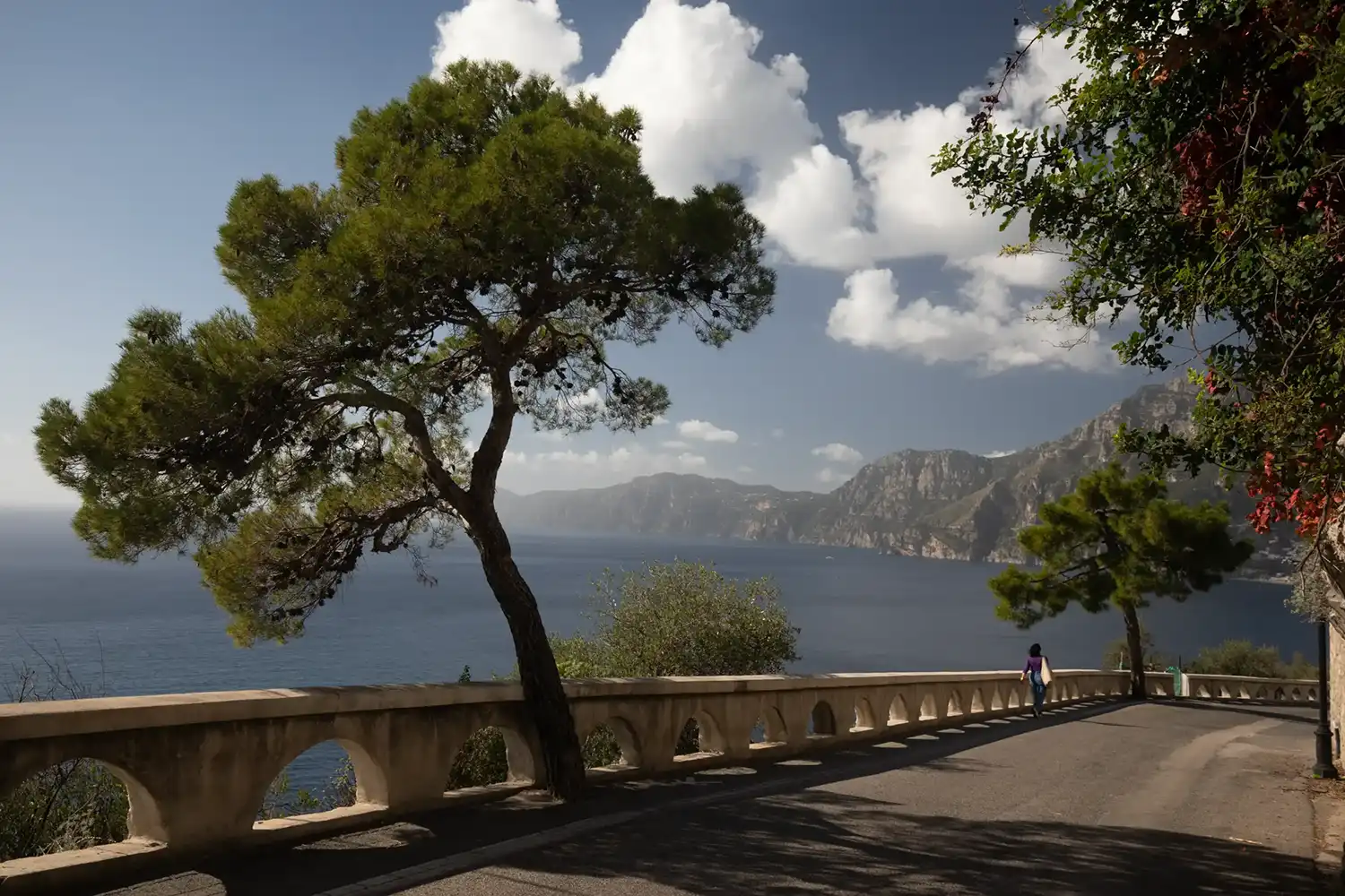
Original unedited raw image
The original, unedited raw image is fairly neutral in color, but it looks a bit dark. It's clearly a bright sunny day, but this isn't reflected in the unedited photo.
This tutorial is about editing the photo sympathetically to show the image with the vibrancy that was there when I took the photo, while still keeping it looking natural and not over edited.
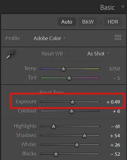
1. Use Auto for a fast, neutral baseline

Tapping Auto gives you a clean technical starting point before you begin shaping the image manually. It is not a shortcut or a replacement for judgment, but it quickly places exposure and contrast into a sensible range.
When working through a shoot, this first pass can save a significant amount of time. Auto provides a neutral baseline that you can refine by eye, adjusting white balance, recovering detail, and shaping the image to suit your intention.
2. Result of Auto
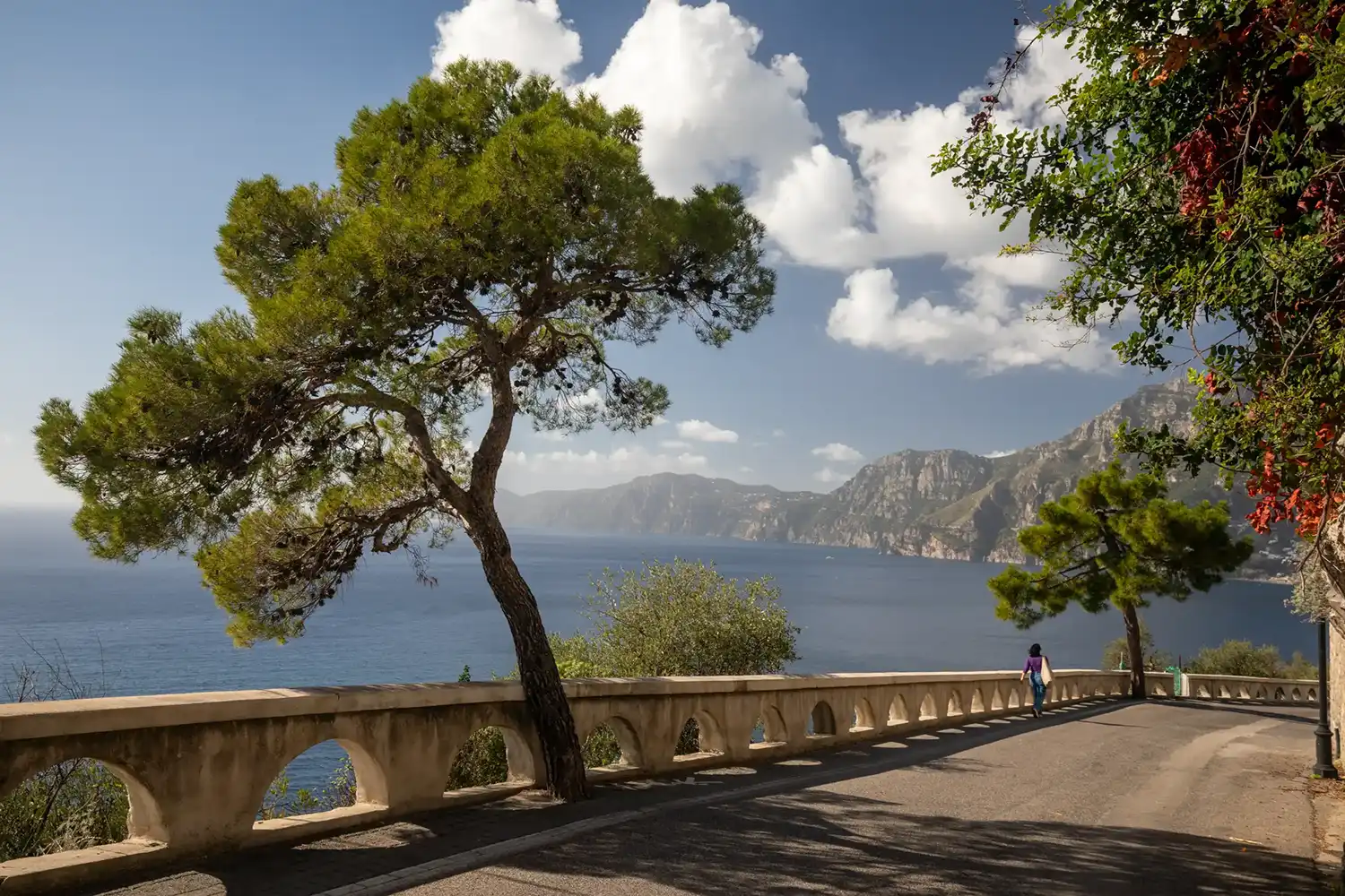

After just clicking the Auto button, the image looks like this. It's an improvement that will help you evaluate the image and make further adjustments.
And it has done so quickly and with little effort, so it's worth trying. If it should happen to produce an awful result, just Undo (Ctrl+Z) and try again with manual adjustments.
3. Start with White Balance

Begin with Temp and Tint (red highlight). If the image looks too warm and yellow, move Temp slightly left; if it looks too cool and blue, move it right. Tint corrects green or magenta casts. This photo did not require changing Temp or Tint.
You can use the White Balance Selector (green highlight), to click on a neutral part of the image, then fine‑tune by eye. That is not needed in this image, but future tutorials will show you how to do this.
In this image and for many shots outside in natural light, it's not necessary to change white balance, but for shots indoors and with artificial lighting, it can be very beneficial. Future tutorials will look at examples in depth.
Tip for easy adjustment of all sliders; Click on the slider button and keep the cursor over the slider button, then use the keyboard arrow keys to move the slider.
4. Exposure Slider
Exposure controls the overall brightness of the image. Adjust it until your main subject — usually a face or key detail — looks properly lit. Do not worry if the background ends up slightly brighter or darker; you will refine this in following steps and after those adjustments, you can come back and readjust.
5. Contrast Slider

Contrast is the difference between the brightest and darkest parts of an image.
Move the Contrast Slider to the right to increase contrast and to the left to decrease contrast.
Contrast can also be changed by adjusting other sliders; Highlights, Shadows, Blacks, Whites, Dehaze, which is what I normally do and we'll look at next.
6. Highlights Slider
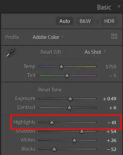
For most photos, you should ensure there is detail in your highlights, (the brightest parts of the photo), so they contain detail and are not "blown out", i.e. appear pure white.
There are exceptions to this, such as sun reflecting off chrome or a reflective surface and these situations will always have no detail in the highlights, but for the most part, losing detail in highlights is to be avoided.
To retain detail in highlights, move the Highlights Slider to the left.
7. Shadows Slider
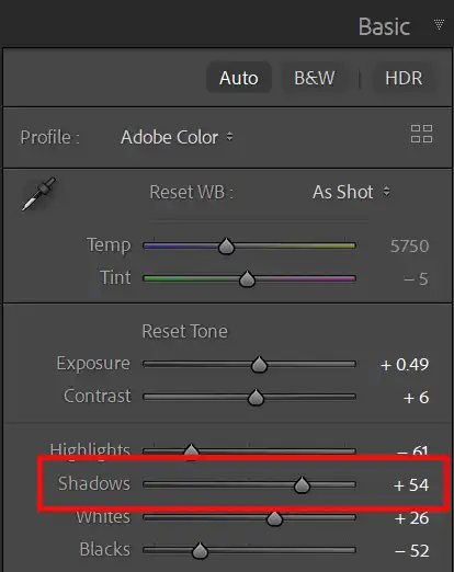
To lighten shadows, move the Shadows Slider to the right and to darken, move the slider to the left. It depends on the image and the area in the photo, as to whether a particular shadow should show detail. For many images, it's beneficial to show some detail in the darkest parts. But sometimes, if the shadow is not an important part of the image, it's fine for the areas to be dark, with no visible detail. Having darker shadows will give your image more contrast and look punchier.
8. Whites Slider

The Whites slider allows you to control how bright the brightest points are. Moving the slider sets the brightness level for brightest parts of the image. This will affect contrast and as I mentioned earlier, this is part of my preferred method to control overall contrast, rather than adjust the contrast slider.
The next steps show how you can also use the Histogram, Highlight Clipping and the Alt key, to accurately monitor the highlights while you adjust white point with the slider.
9. Blacks Slider
The Blacks slider does the opposite of the Whites slider, setting the black point in the photo, which controls how dark the darkest parts of the photo will be.
The next steps show how you can also use the Histogram, Shadows Clipping and the Alt key, to accurately monitor the shadows while you adjust black point with the slider.
10. Histogram & Highlight Clipping
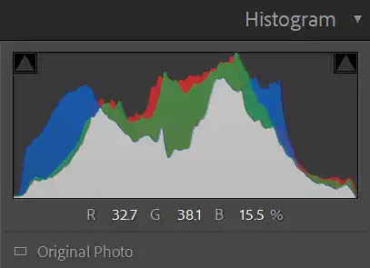 Shadow and Highlight Clipping is OFF
 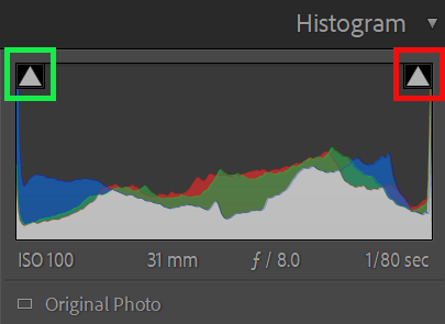 Shadow and Highlight Clipping are ON, indicating loss of detail
 Although we are only editing using the Basic panel in this tutorial, it's good practice to keep an eye on the Histogram panel while you're editing. Histograms are an excellent editing tool. If you increase the whites too much, you can lose detail in the highlights. This is called Clipping. The Lightroom Histogram will warn you of this with the Show Highlight Clipping triangle in the top right corner of the Histogram (red highlight ). Note that the Shadow Clipping is also indicating a loss of detail in the shadows (green highlight).
11. Whites Slider Preview


If you press and hold down the Alt key (Option on Mac), while you drag the Whites slider you will see a real time preview. When there is no clipping, the screen is entirely black, but when clipping occurs, you will see areas appear, in white, or a color. Areas in a color indicate the channel that is being clipped. Areas in white indicate all channels are being clipped.
Adjust Whites to where they begin to be clipped, then release the Alt key to see the image.
12. Whites Slider Preview

When you release the Alt key, you will see your image. The Highlight Clipping is visible in the photo and the preview.
13. Blacks Slider Preview

It works the same for the Blacks slider. Press and hold the Alt key while you drag. When there is no clipping the screen will be entirely white. As you increase the Blacks you will see clipping.
This technique with the Alt key works on the following sliders; Exposure, Highlights, Shadows, Whites, Blacks, Dehaze.
It also works on the same sliders in Camera Raw and in Photoshop on the black and white sliders in Levels.
14. Presence
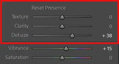
The Presence section includes Texture, Clarity, and Dehaze. These control crispness and punch.
15. Texture
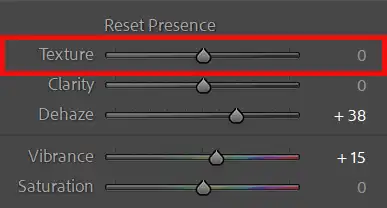
Texture enhances small details such as the bark on a tree, leaves. Move the slider to the left to decrease texture and move it to the right to increase texture. Reducing texture (negative texture) works well for smoothing skin
Be careful not to overdo this slider.
16. Clarity
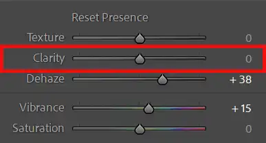
Clarity affects contrast of middle tones and also edge sharpness, but if overdone, it can introduce unwanted halos along the over sharpened edges. Clarity doesn't affect the lightest lights and darkest darks. Increasing Clarity adds contrast to the midtones.
Decreasing Clarity (negative clarity) is very effective for skin.
Clarity is a popular tool, but it is often overused. It tends to increase larger details than those affected by texture, so use both of them to affect different parts of the photo.
Be especially careful not to overdo this slider.
17. Dehaze
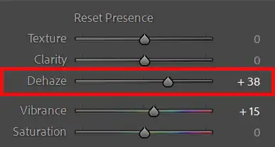
Dehaze adjusts areas with low contrast, leaving higher contrast areas unchanged. Whereas the Contrast slider affects all areas and will make the lights lighter and the darks darker.
Drag the Dehaze slider to the right to reduce haze, mist or fog and drag to the left to increase haze, mist and fog.
Dehaze is a favorite method to increase contrast in a landscape image, but be aware that it can darken the image, which can be offset by increasing exposure. It also makes colors more vibrant and if this is too much, consider reducing Vibrance or Saturation.
18. Refine color with Vibrance and Saturation
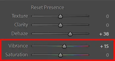
Vibrance boosts weaker colors. and protects skin tones, making it ideal for people photography.
Saturation increases all colors. equally and can quickly look artificial.
Start with a small increase in Vibrance and adjust Saturation only if needed.
In this image I have not adjusted Vibrance or Saturation, apart from the changes created by Auto.
19. Review your Before/After
Press Backslash (\) to toggle between the original and your edit. This is the quickest way to view before and after your adjustments.
You can either press and hold the backslash key, or press and release and then press and release again. Both methods switch between the before and after comparison, which should be a part of all photo editing work. You should check that your editing is improving the photo and you haven't overdone it.
When you are evaluating, look for light looking natural and skin tones look believable. A good Basic edit should not be noticed as an edit.
In this photo I have not changed these sliders; Contrast, Texture, Clarity, Vibrance, Saturation. The only changes were made by selecting Auto.
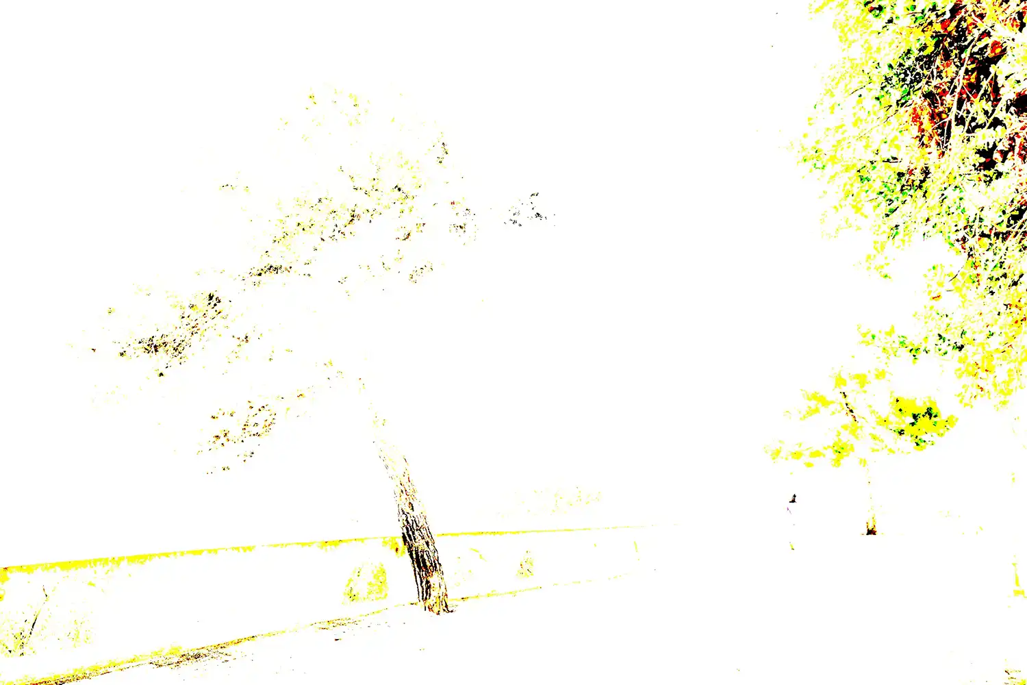
Texture, Clarity, Dehaze Comparison

Common mistakes to avoid
- Be careful not to adjust any slider too much.
- Extreme Highlights or Shadows values.
- Don't increase Clarity or Dehaze on faces, creating harsh texture.
- Overusing Saturation instead of Vibrance.
- Skipping Whites and Blacks, leaving the image dull.
- Use the Alt key while adjusting, to see a preview of your edits (exposure, highlights, shadows, whites, blacks).
Summary and exercise
The above steps would stand you in very good stead to be adopted for editing your photos, especially as a first pass. With individual images, you may then wish to tweak different aspects. I recommend you do so by creating Virtual Copies, which add almost nothing to your storage.
Choose a RAW file and create a Virtual Copy (right-click the image and select Create Virtual Copy). Or create multiple Virtual Copies. They are a very efficient way of working, as the edits are stored in tiny sidecar files. Then you can try different settings on multiple versions of the same image.
Work through this sequence:
- Tap Auto for a quick baseline
- Set a believable white balance if lighting is artificial.
- Adjust Exposure for your main subject
- Adjust contrast with Highlights and Shadows.
- Set Whites and Blacks for depth.
- Add subtle Texture, use Clarity and Dehaze sparingly.
- Increase Vibrance gently.
- Toggle Before/After and refine.
- Get to know what you can and can't do with that image
- Try on a different image
If you next photo has the same, or very similar content, click on the Previous button to apply the same settings instantly. Even if there is a slight difference in the photos, this is a fast way to start on the next photo.
See the Lightroom Histogram tutorial to understand and use the Histogram more effectively.